Methodology
For our analysis, we performed the following steps.
Results
Below you can see the results of each step.
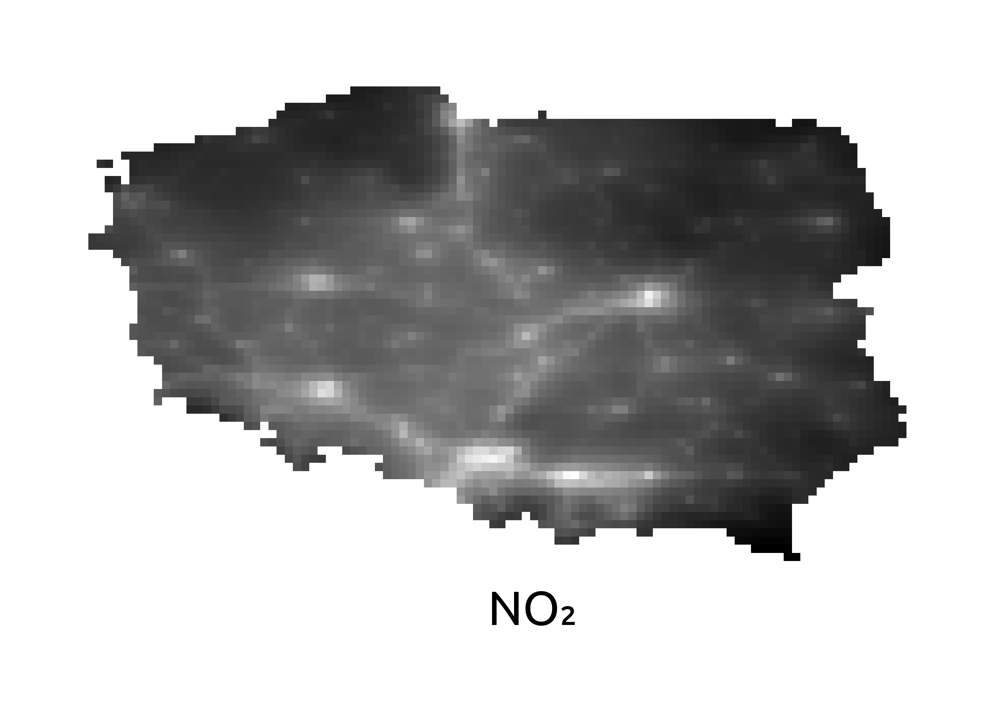
Step 1 – Monthly Pollutant Maps for Poland (Dec 2022)
In Step 1, the objective was to generate raster maps for the three pollutants —NO₂, PM₂.₅ and PM₁₀— for December 2022 over Poland.
This involved downloading CAMS data for that period, clipping it to Poland’s boundaries, and exporting the following raster layers:
Poland_CAMS_no2_2022_12.tif
Poland_CAMS_pm2p5_2022_12.tif
Poland_CAMS_pm10_2022_12.tif
Step 2 – Yearly Average Pollutant Maps for 2022
In Step 2, the goal was to compute the annual average concentration maps for the same three pollutants over Poland for the year 2022.
This included the temporal aggregation of monthly CAMS data and produced the following layers:
Poland_average_no2_2022.tif
Poland_average_pm2p5_2022.tif
Poland_average_pm10_2022.tif
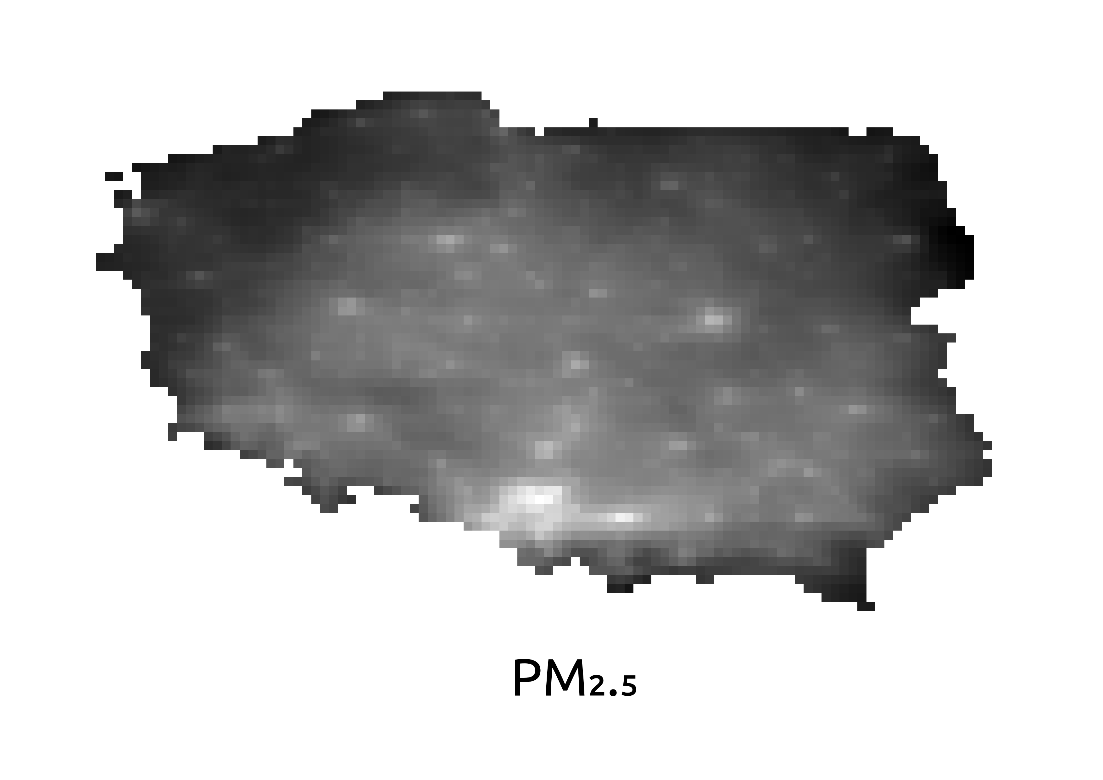
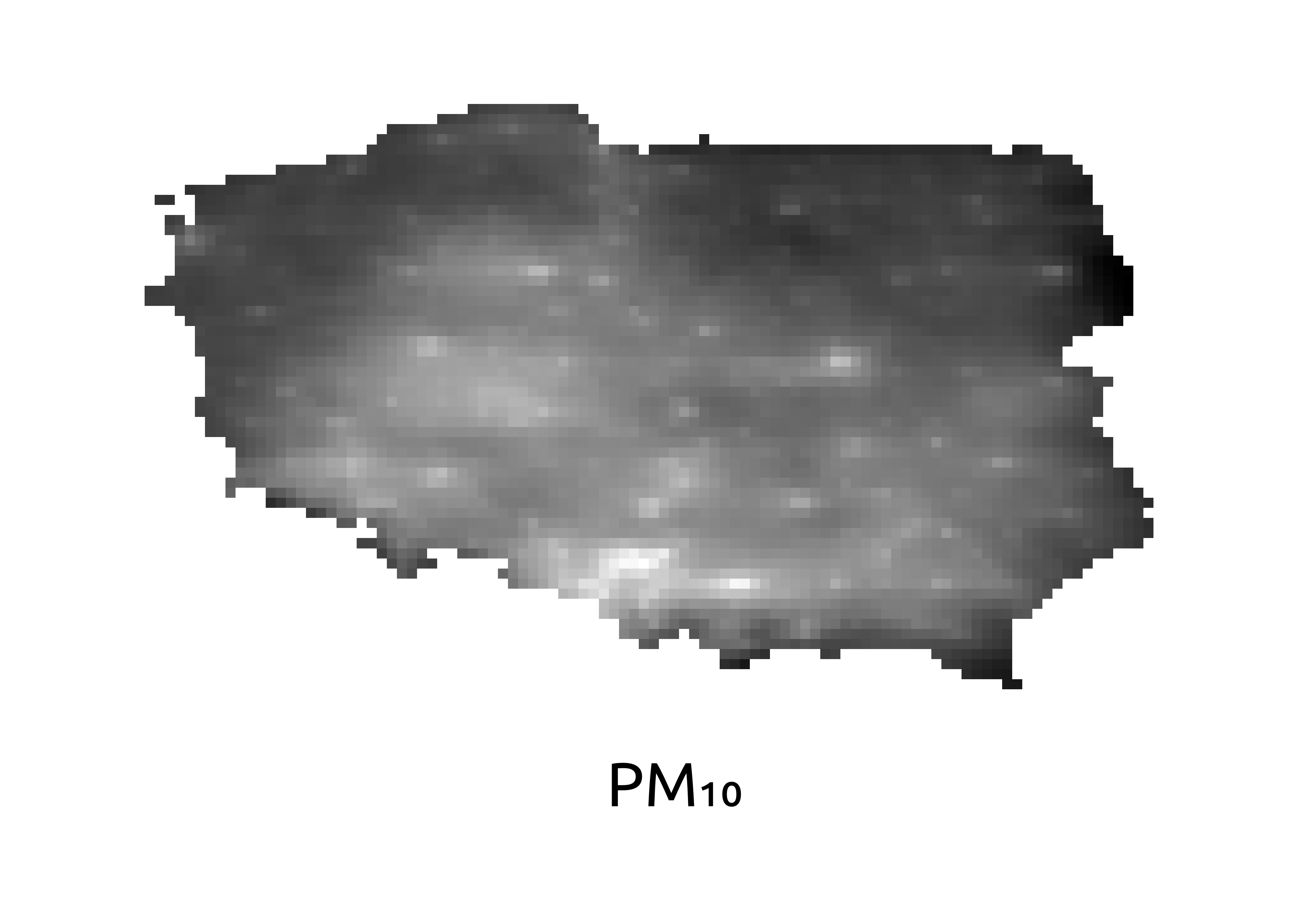
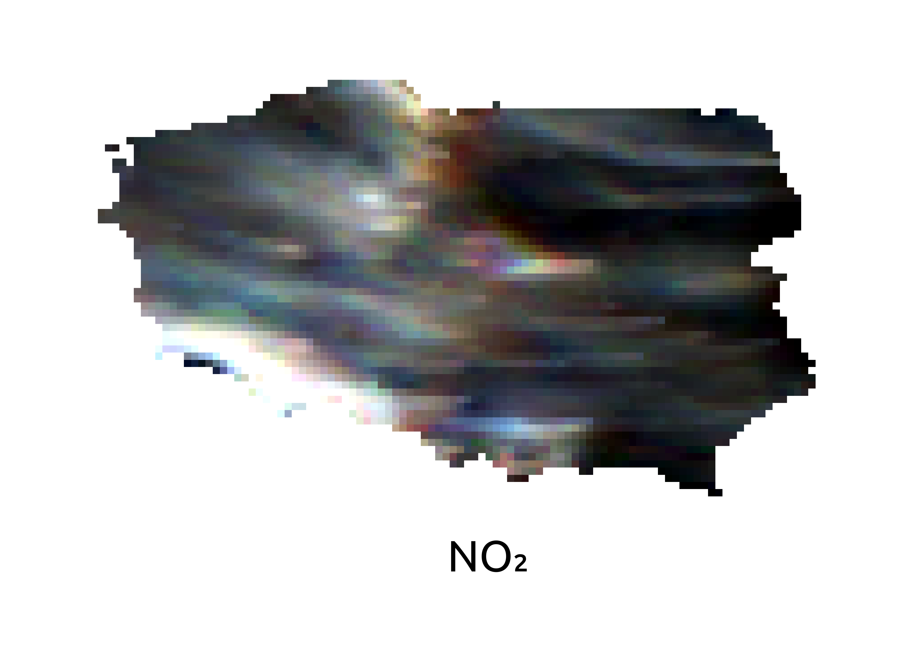
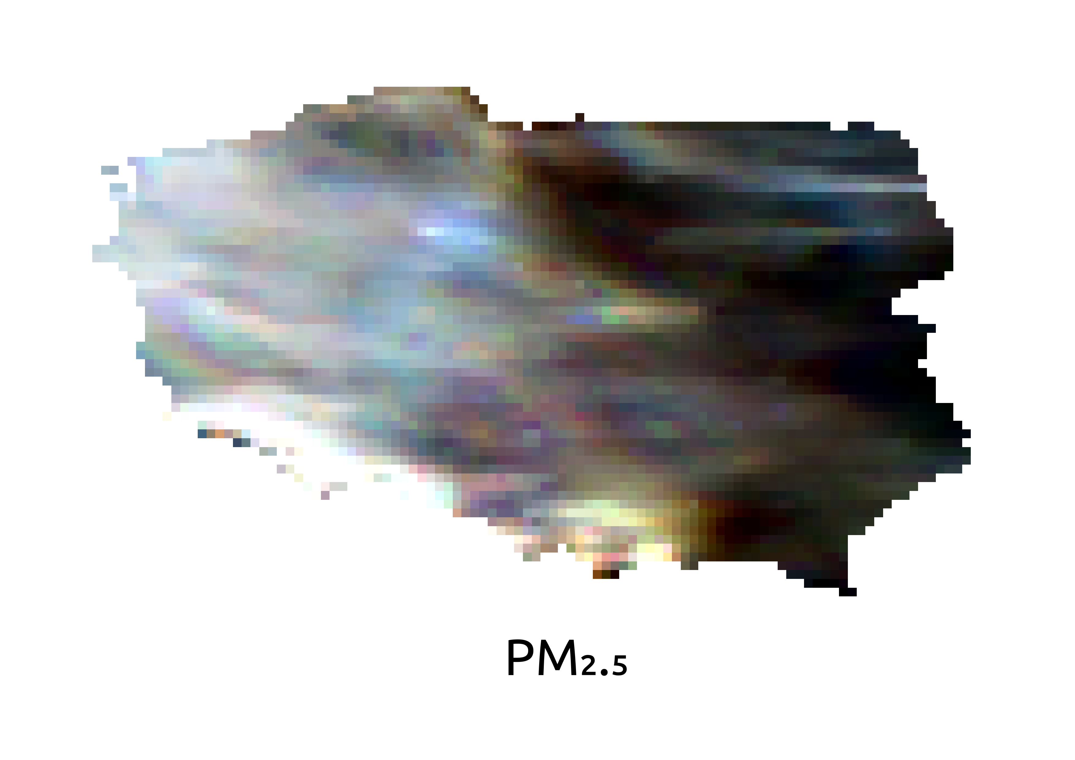
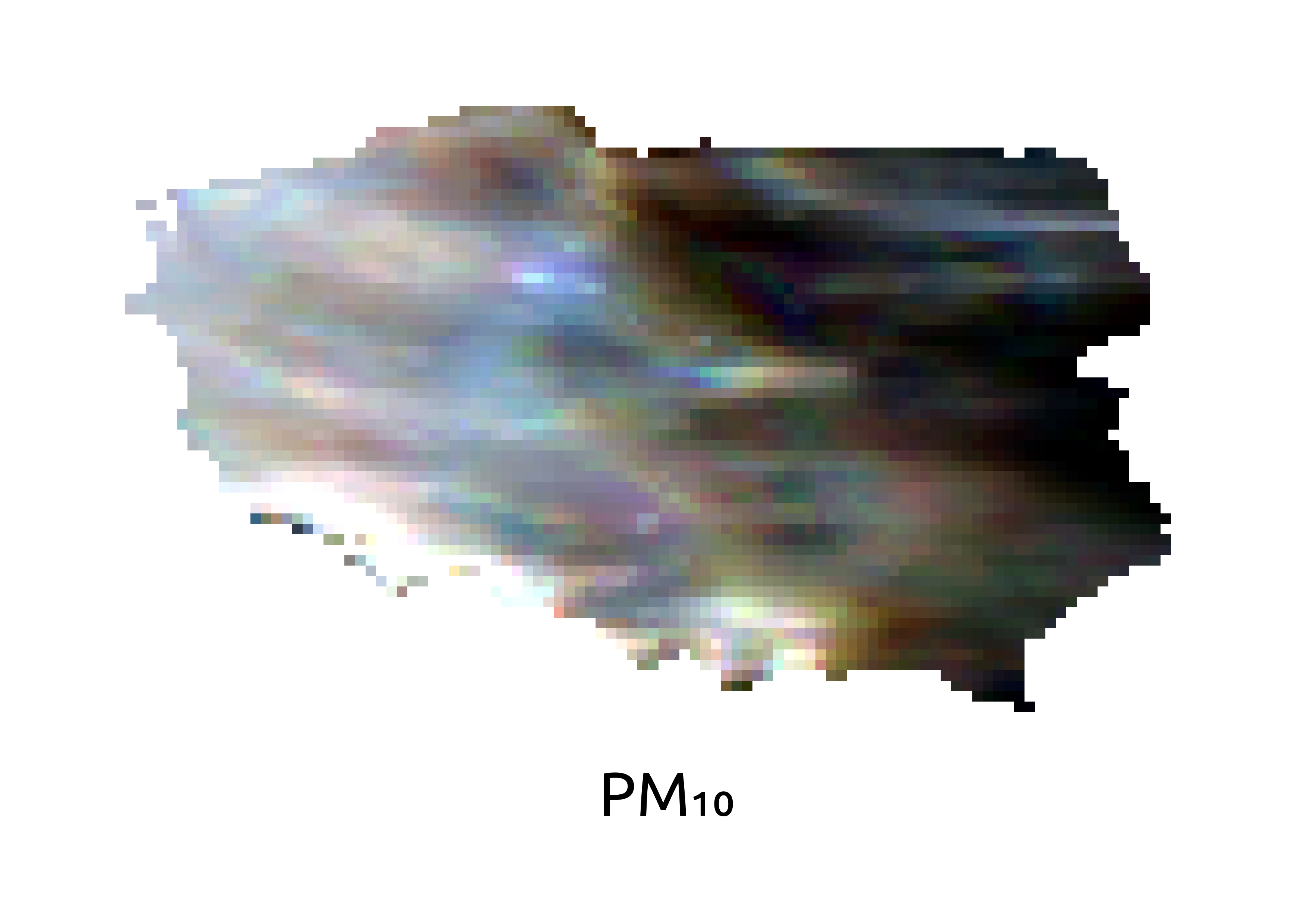
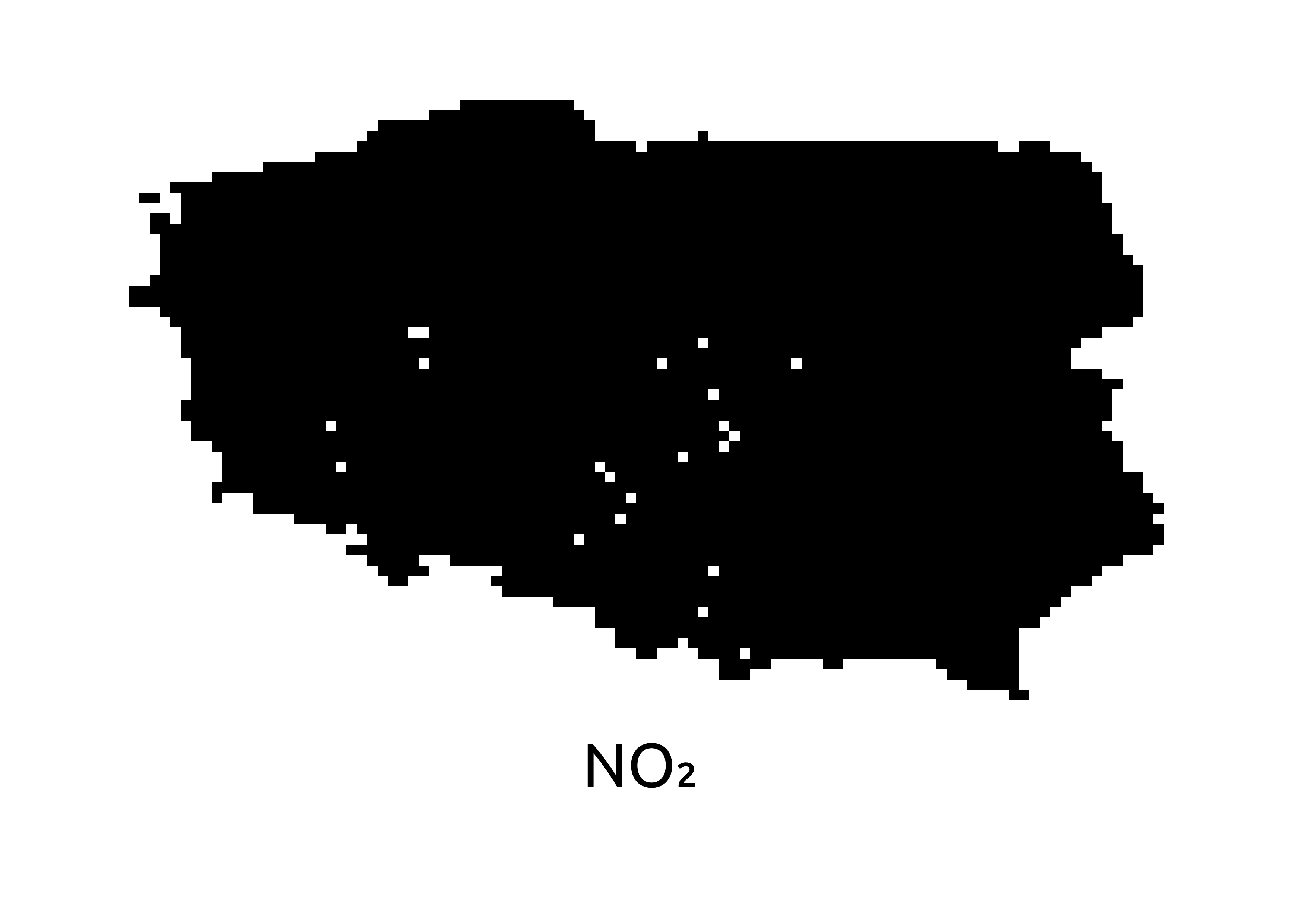
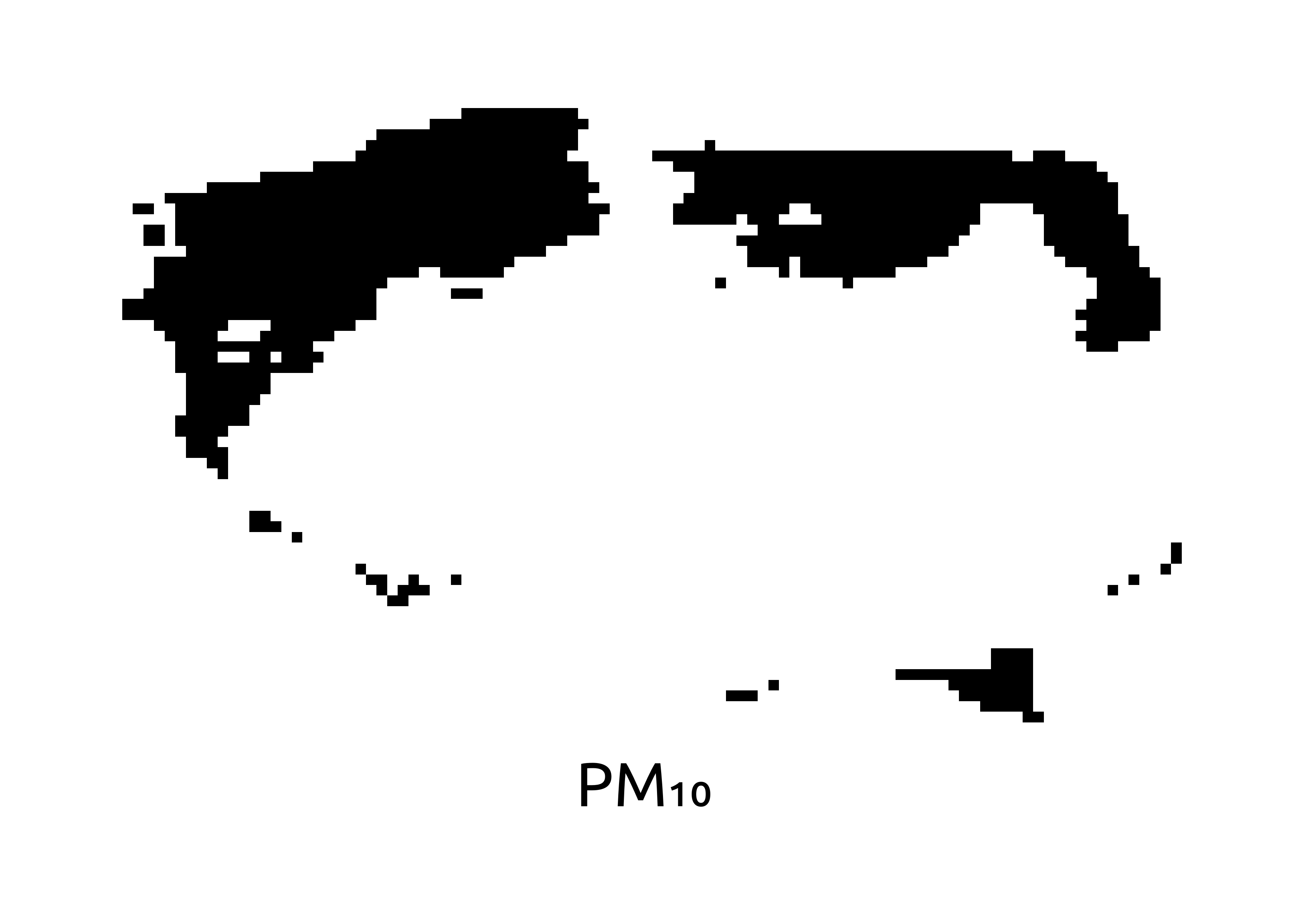
Step 3 – Pollutant Concentration Maps for 2020
In Step 3, we processed CAMS data from 2020 to generate the raw pollutant concentration maps for NO₂, PM₂.₅ and PM₁₀, clipped to the Polish territory.
The following produced layers can be seen on the right:
Poland_no2_concentration_map_2020.tif
Poland_pm2p5_concentration_map_2020.tif
Poland_pm10_concentration_map_2020.tif
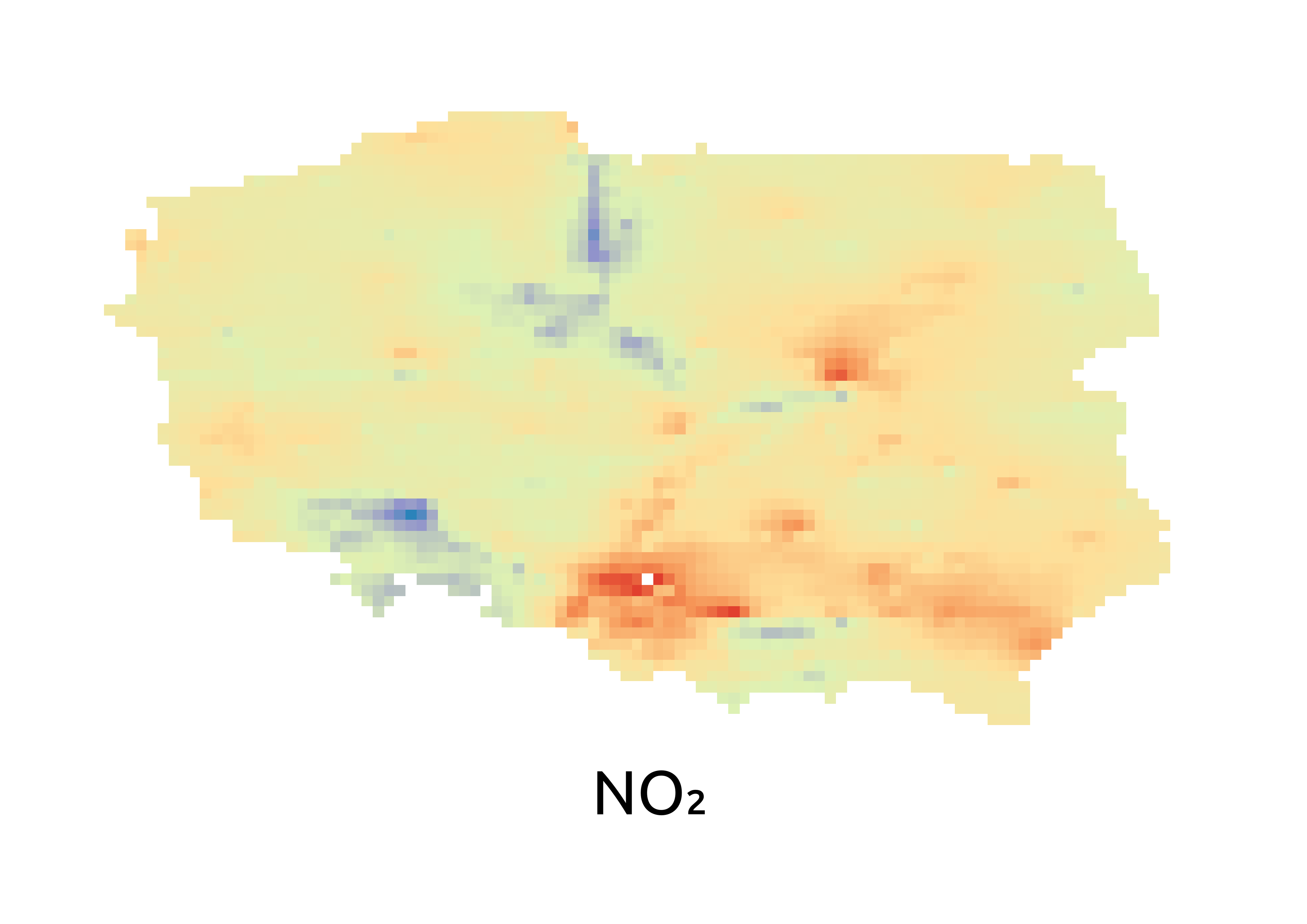
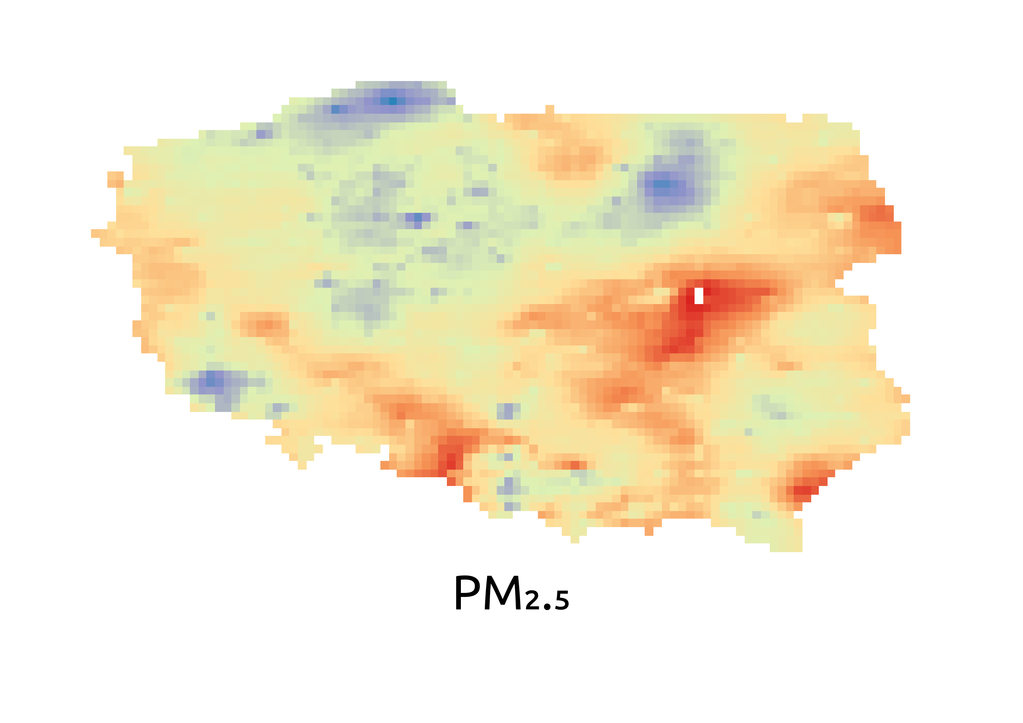
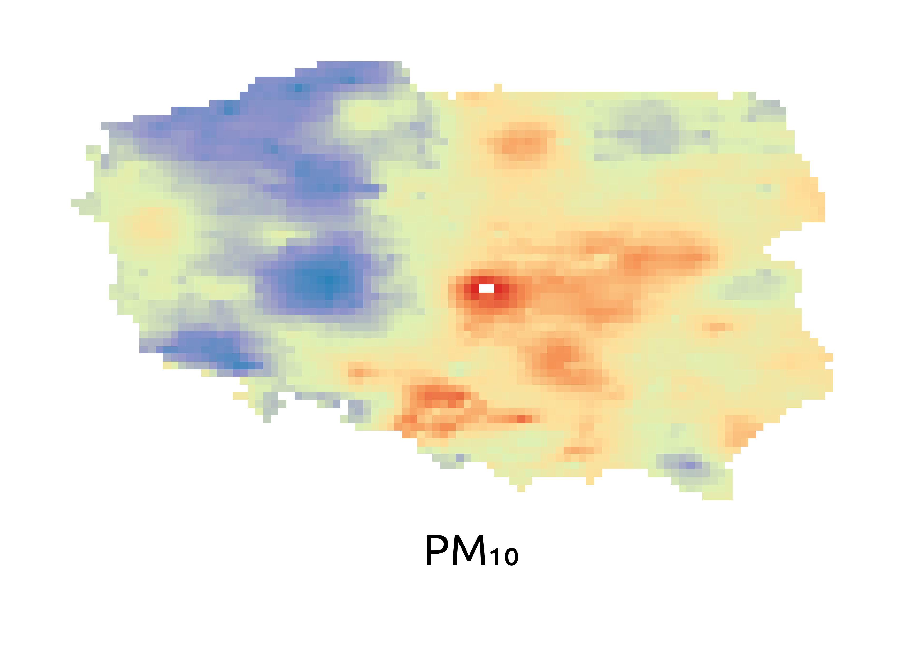
Step 4 – Annual Average Difference from 2017–2021 Mean
In Step 4, we calculated the difference between the 2022 annual average pollutant values and the mean of 2017–2021 for each pollutant, creating anomaly maps and associated SLD styles. The following produced styled layers can be seen on the right:
Poland_no2_2017-2021_AAD_map_2022.tif and .sld
Poland_pm2p5_2017-2021_AAD_map_2022.tif and .sld
Poland_pm10_2017-2021_AAD_map_2022.tif and .sld
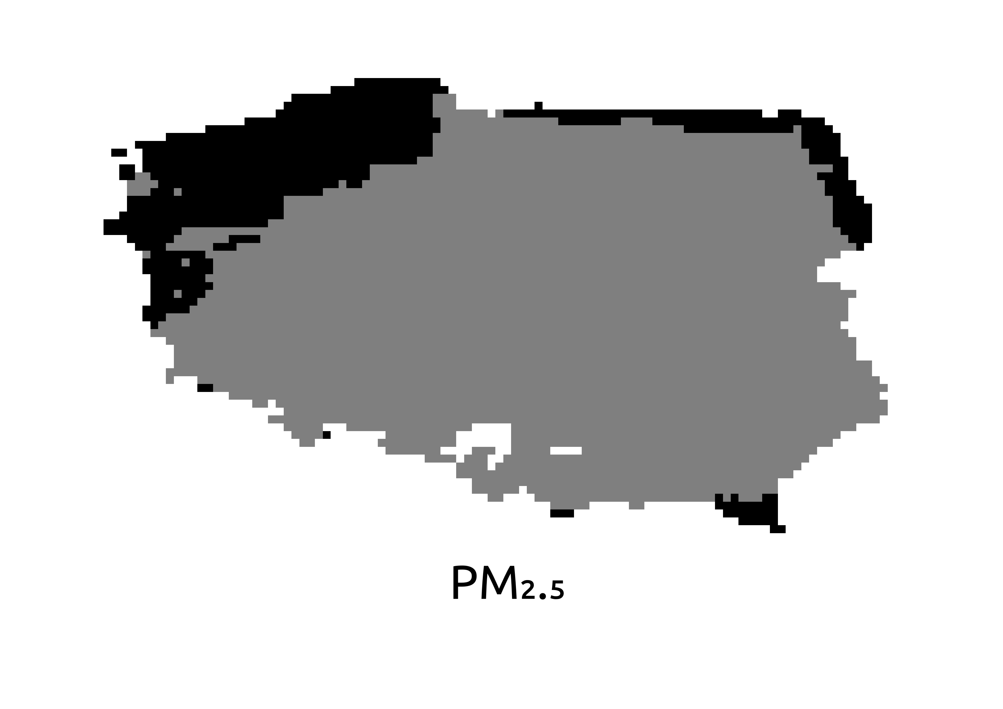
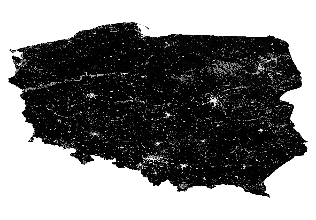
Step 5 – Reclassified Land Cover Map for 2022
In Step 5, the ESA CCI Land Cover map for 2022 was downloaded and clipped to Poland. Using the IPCC schema, land cover classes were reclassified into broader categories (e.g., agriculture, urban, forest), and the output was the following layer seen on the right:
Poland_LC_reclassified_2022.tif
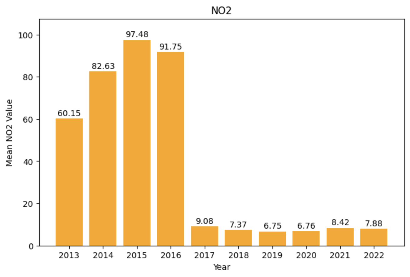
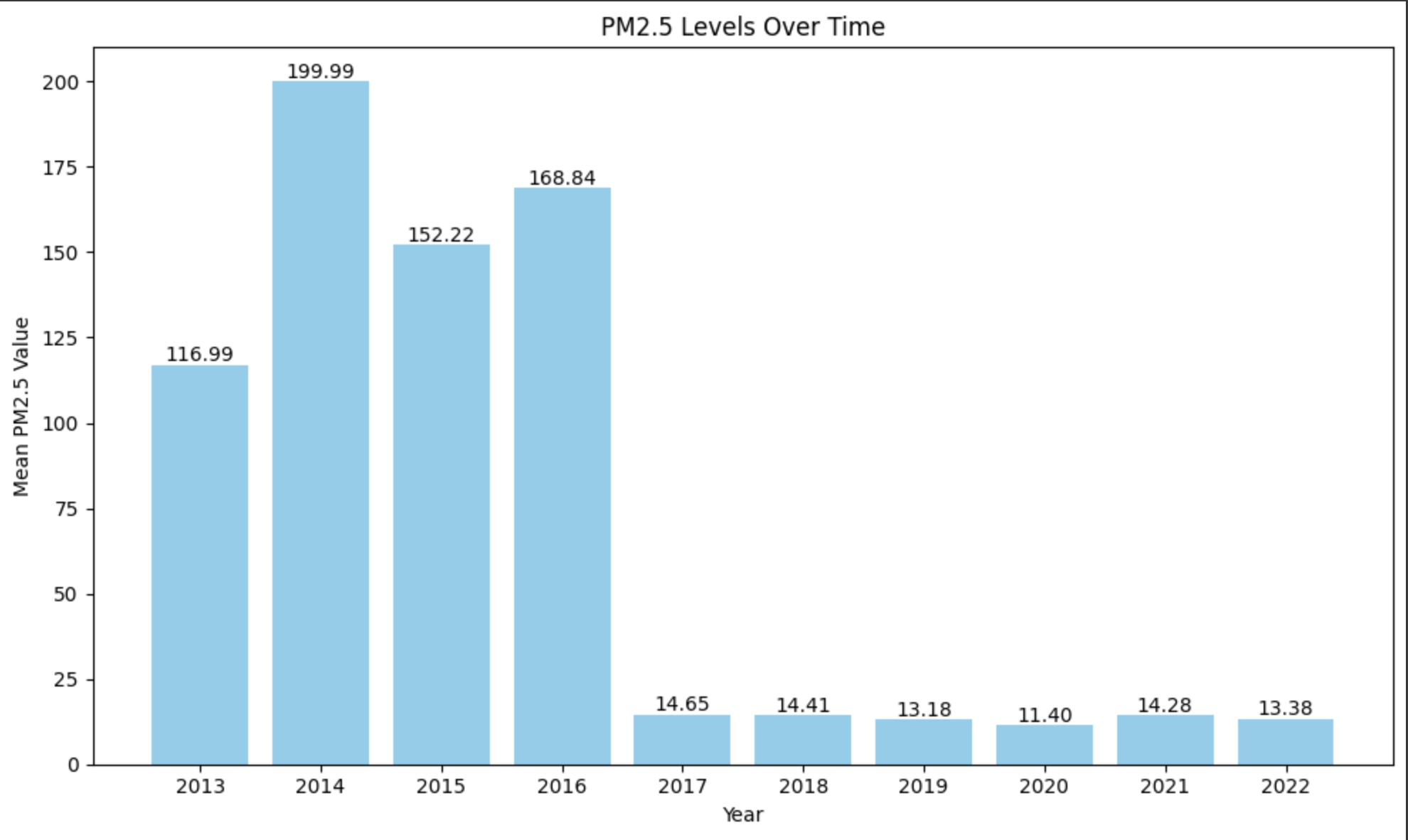
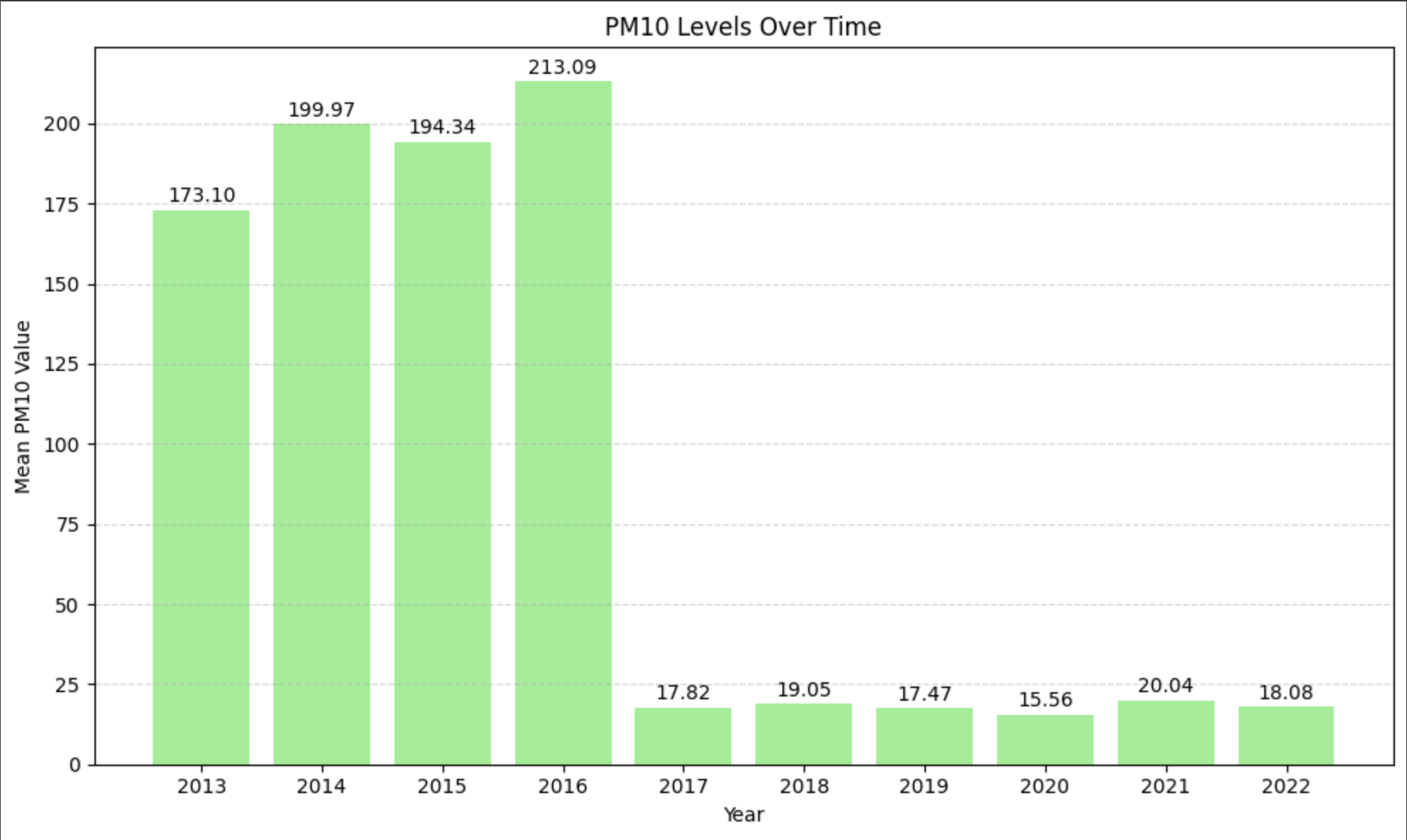
Step 6 – Resampling and Zonal Statistics Over Urban Areas
In Step 6, the CAMS average pollutant rasters are resampled to match the 300m resolution of the ESA land cover map. Then, urban land cover areas are polygonized and zonal statistics (mean, max) are computed over these polygons for each pollutant, which can be seen in the form of bar charts on the right.
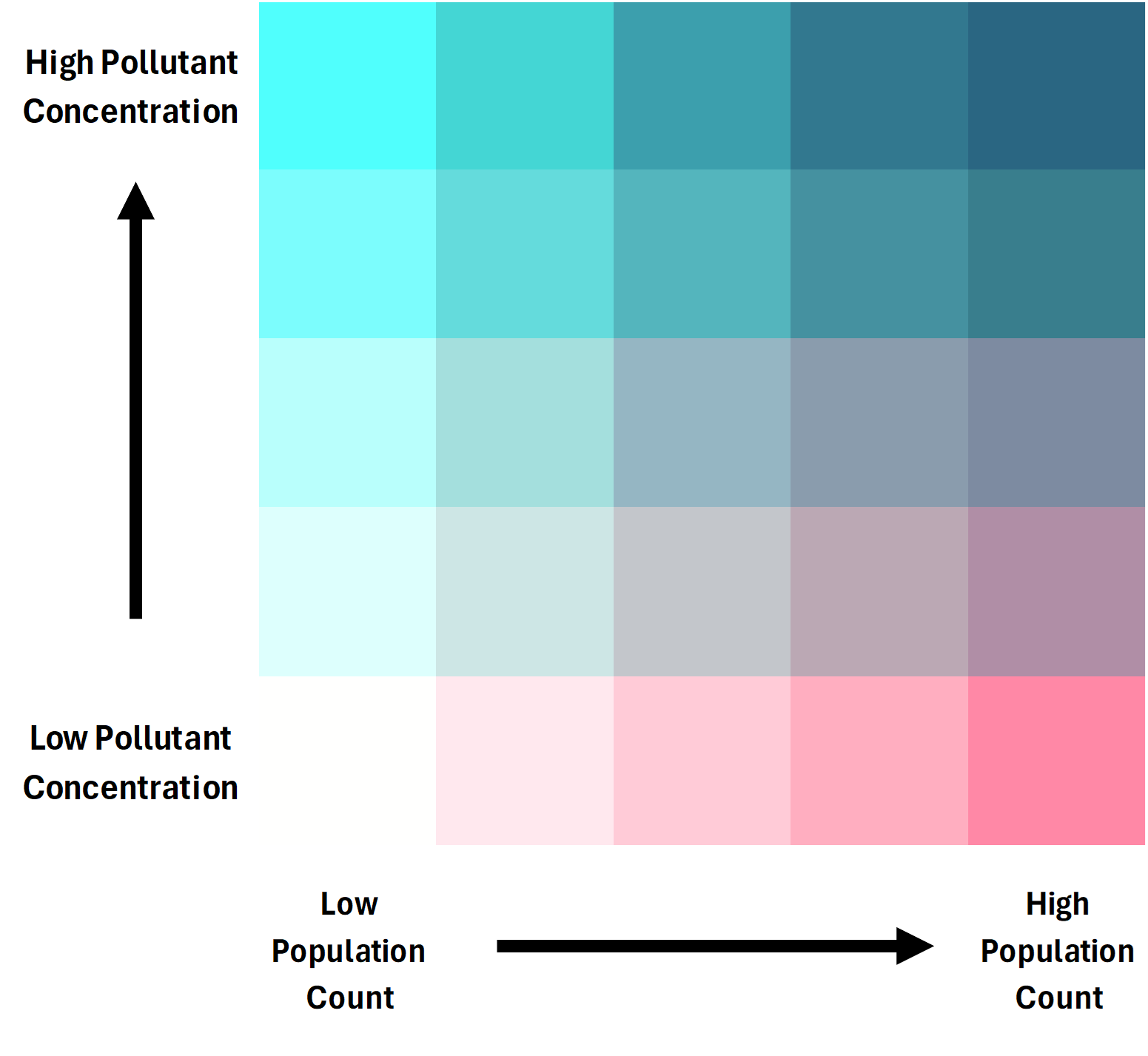
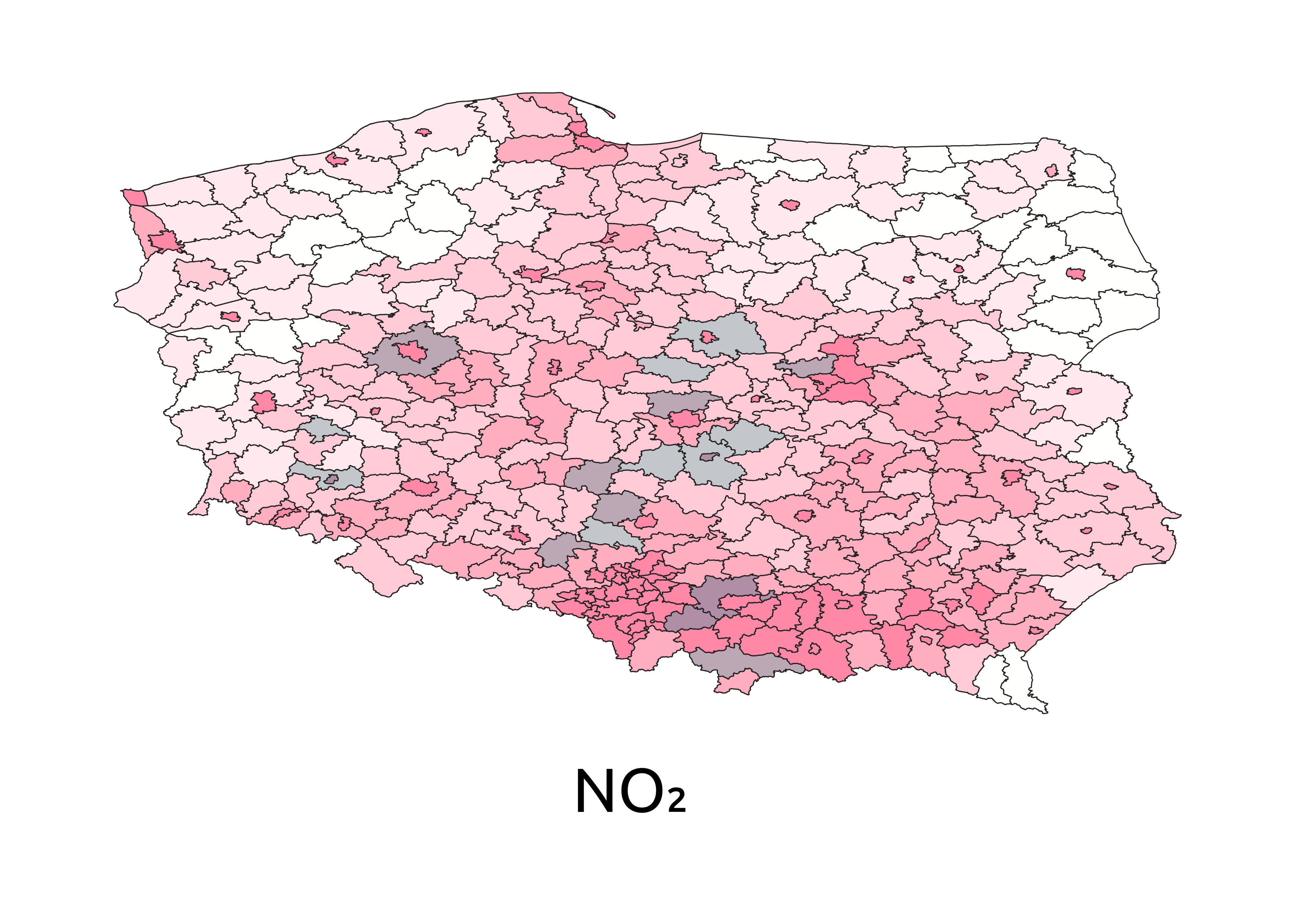
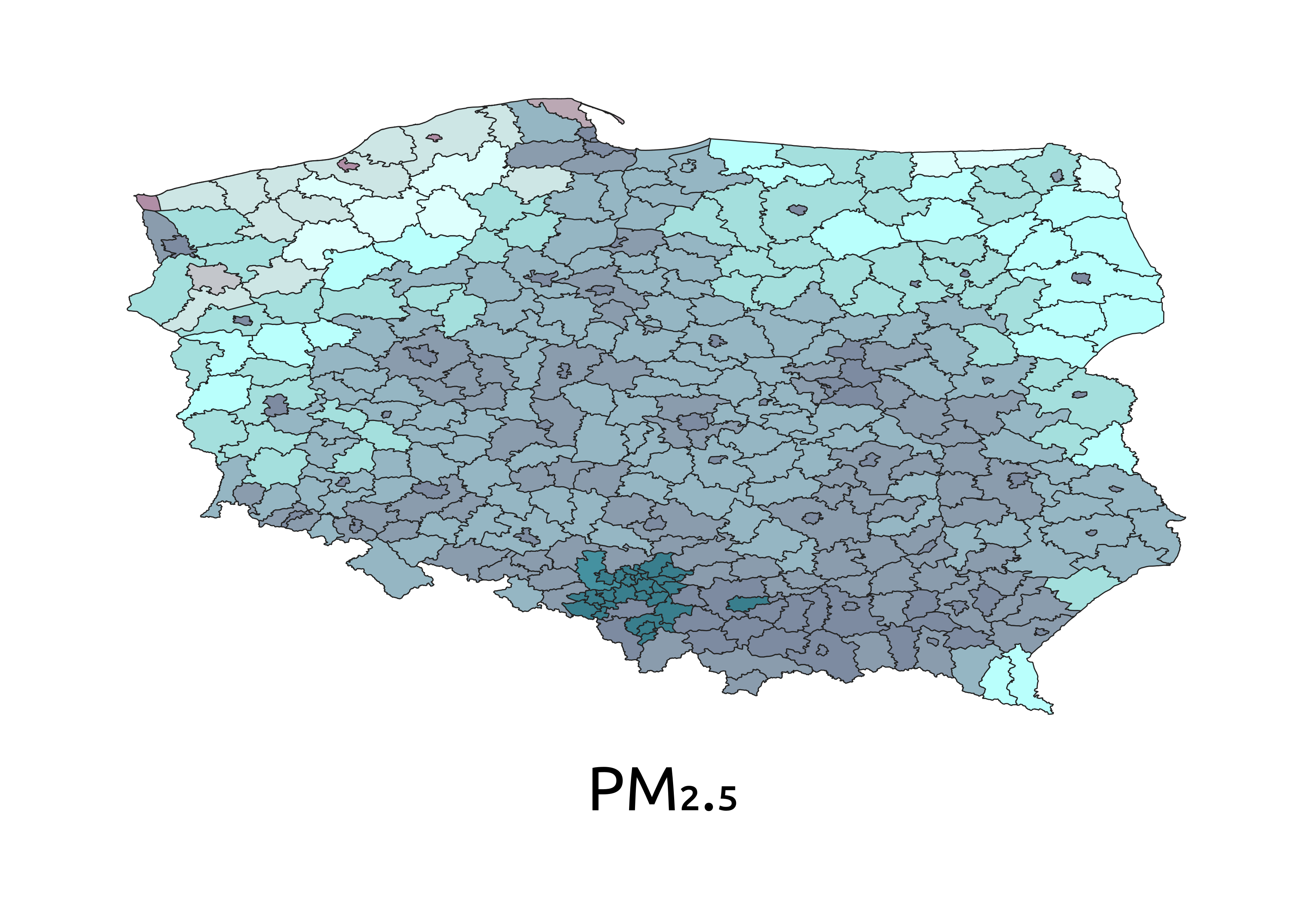
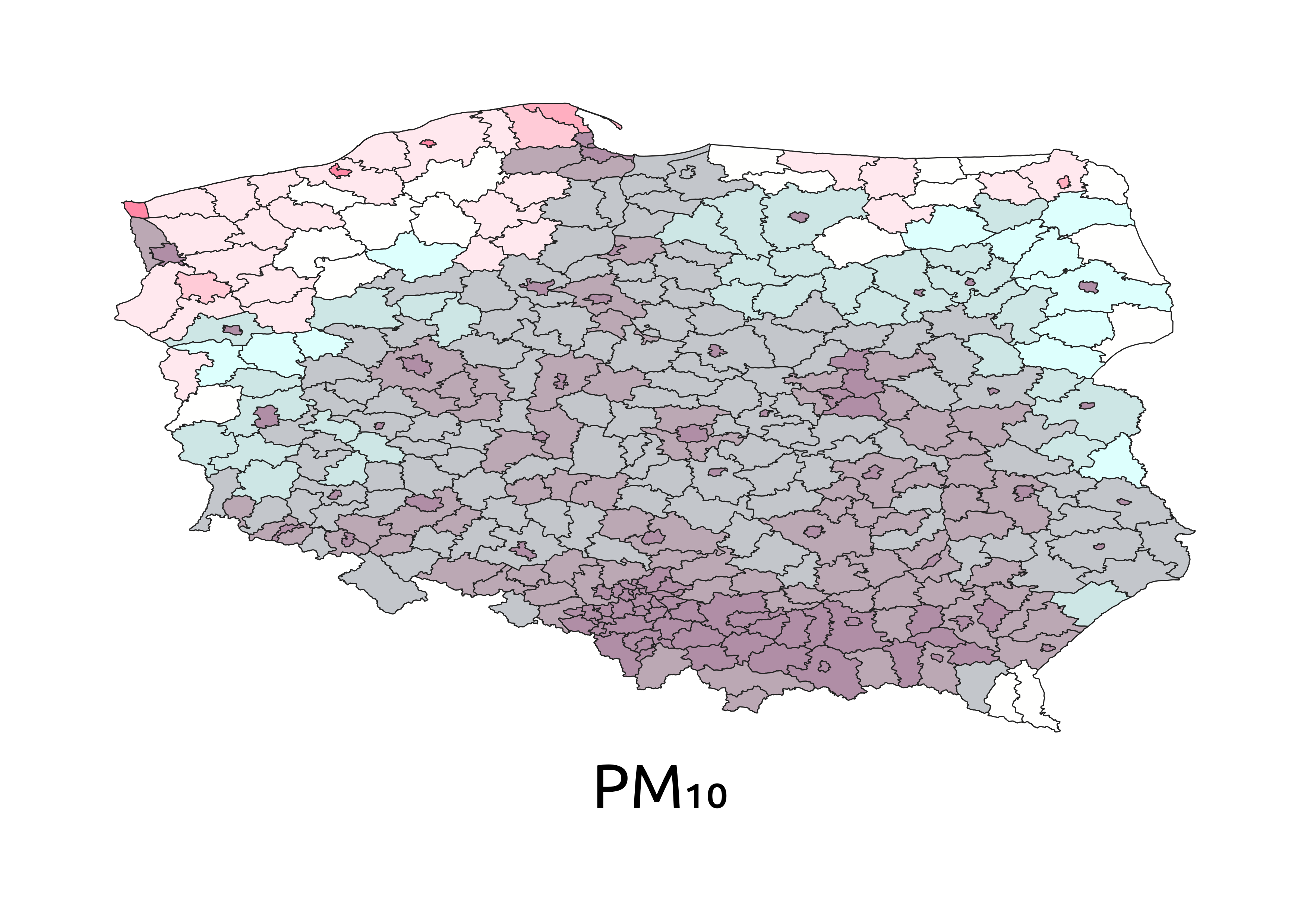
Step 7 – Bivariate Analysis of Pollution and Population
In Step 7, population count data (WorldPop 2020) for Poland is reclassified into 5 quantile-based classes. A bivariate index combining population density and pollutant concentration is created per administrative zone using GAUL Level 2 boundaries. The bivariate maps for each pollutant can be seen in the right with the corresponding legend below:
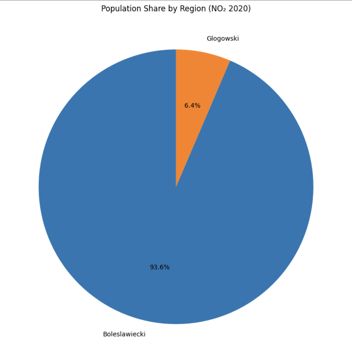
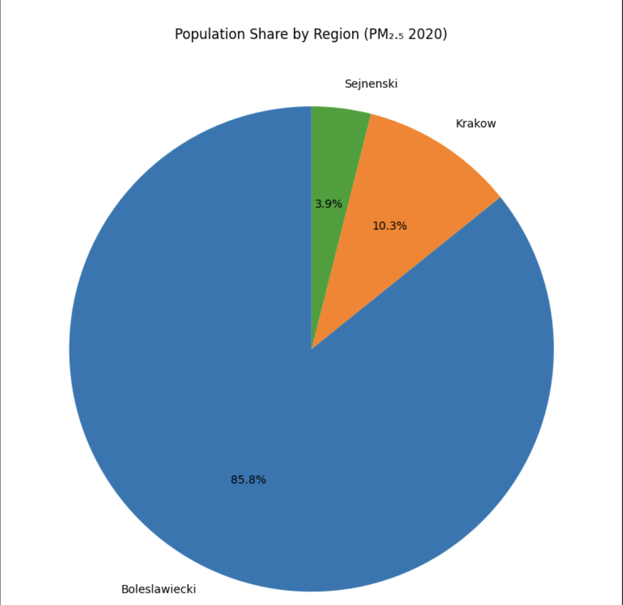
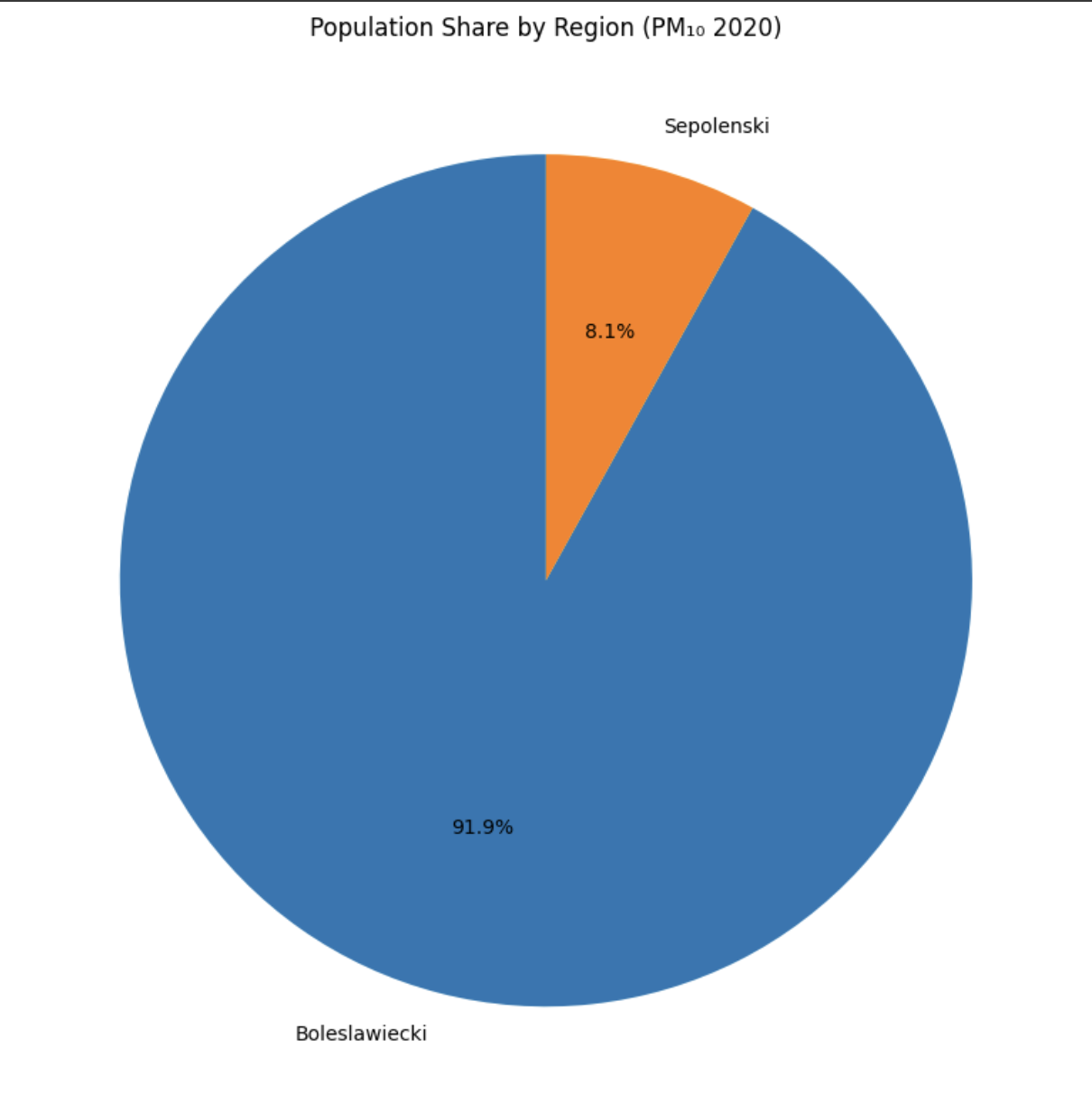
Step 8 – Final Population Exposure Visualization
In Step 8, the pollutant bivariate layers are dissolved by pollutant class and used to create pie charts showing population exposure per pollutant category. This visual summary helps communicate how many people are exposed to each air quality level. The pie charts can be seen on the right.
For an interactive visualization, we have also included a WebGIS page in our analysis. We used an online Geoserver instance of Politecnico di Milano to share our geospatial data and Openlayers library for creating the interactive map page.
See the Map